 微信登录
微信登录与注册
微信登录
微信登录与注册

 手机号登录
手机号登录
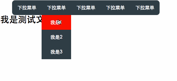
第一种:display:none和display:block切换
<!DOCTYPE html>
<html lang="en">
<head>
    <meta charset="UTF-8">
    <title>Document</title>
    <style>
        ul{
            list-style: none;
        }
        .nav>li{
            float: left;
        }
        ul a{
            display: block;
            text-decoration: none;
            width: 100px;
            height: 50px;
            text-align: center;
            line-height: 50px;
            color: white;
            background-color: #2f3e45;
        }
        .nav>li:first-child a{
            border-radius: 10px 0 0 10px;
        }
        .nav>li:last-child a{
            border-radius: 0 10px 10px 0;
        }
        .drop-down{
            /*position: relative;*/
        }
        .drop-down-content{
            padding: 0;
            display: none;
            /*position: absolute;*/
        }

        h3{
            font-size: 30px;
            clear: both;
        }
        .drop-down-content li:hover a{
            background-color:red;
        }
        .nav .drop-down:hover .drop-down-content{
            display: block;
        }
</style>
</head>
<body>
    <ul class="nav">
        <li><a href="#">下拉菜单</a></li>
        <li class="drop-down"><a href="#">下拉菜单</a>
            <ul class="drop-down-content">
                <li><a href="#">我是1</a></li>
                <li><a href="#">我是2</a></li>
                <li><a href="#">我是3</a></li>
            </ul>
            </li>
        <li><a href="#">下拉菜单</a></li>
        <li><a href="#">下拉菜单</a></li>
        <li><a href="#">下拉菜单</a></li>
    </ul>
    <h3>我是测试文字</h3>
</body>
</html>

这是首先考虑到的实现方法,给 .drop-down-content 添加display:none,当悬浮在.drop-down上时 .drop-down-content的display变成block,缺点是不能添加过渡属性,慢慢弹出下来菜单。当.drop-down-content显示时会把后面的盒子往下挤,因为.drop-down-content 显示时是存在于文档流中的,给.drop-down设置position:relative,.drop-down-content设置position:absolute,使下拉菜单脱离了文档流来解决,上面注释的地方改过来即可
第二种方法:给悬浮的这个li设置一个固定高度,然后设置超出部分隐藏,悬浮时显示。
<style>
        ul{
            list-style: none;
        }
        .nav>li{
            float: left;
        }
        ul a{
            display: block;
            text-decoration: none;
            width: 100px;
            height: 50px;
            text-align: center;
            line-height: 50px;
            color: white;
            background-color: #2f3e45;
        }
        .nav>li:first-child a{
            border-radius: 10px 0 0 10px;
        }
        .nav>li:last-child a{
            border-radius: 0 10px 10px 0;
        }
        .drop-down{
            /*position: relative;*/
            height: 50px;
            overflow: hidden;
        }
        .drop-down-content{
            padding: 0;
            /*position: absolute;*/
        }

        h3{
            font-size: 30px;
            clear: both;
/*            position: relative;
            z-index: -1;*/
        }
        .drop-down-content li:hover a{
            background-color:red;
        }
        .nav .drop-down:hover{
            overflow: visible;
        }
</style>
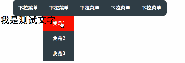
有个问题:h3段落里面的文字会从下拉菜单中透过来,并且鼠标放在字上面的时候下拉菜单会缩回。
解决方式有两种:
1.给.drop-down设置position:relative,.drop-down-content设置position:absolute。
2.给h3设置position:relative;z-index:-1。
第三种方法:给下拉菜单设置固定的高度,下拉菜单的内容设置透明opacity: 0;,悬浮在下拉菜单时opacity: 1;来实现
<style>
        ul{
            list-style: none;
        }
        .nav>li{
            float: left;
        }
        ul a{
            display: block;
            text-decoration: none;
            width: 100px;
            height: 50px;
            text-align: center;
            line-height: 50px;
            color: white;
            background-color: #2f3e45;
        }
        .nav>li:first-child a{
            border-radius: 10px 0 0 10px;
        }
        .nav>li:last-child a{
            border-radius: 0 10px 10px 0;
        }
        .drop-down{
            /*position: relative;*/
            height: 50px;
        }
        .drop-down-content{
            padding: 0;
            opacity: 0;
            /*position: absolute;*/
        }

        h3{
            font-size: 30px;
            clear: both;
/*            position: relative;
            z-index: -1;*/
        }
        .drop-down-content li:hover a{
            background-color:red;
        }
        .nav .drop-down:hover .drop-down-content{
            opacity: 1;
        }
</style>
效果同上。
上面的几种方法都是不能添加过渡效果的,鼠标滑过时下拉菜单就马上弹出来了,用户体验不是很好,下面这种方法可以添加过渡的效果来实现一定时间内来弹出
方法四:将下拉菜单的ul高度设置为0,并且超出部分隐藏掉。
<style>
        ul{
            list-style: none;
        }
        .nav>li{
            float: left;
        }
        ul a{
            display: block;
            text-decoration: none;
            width: 100px;
            height: 50px;
            text-align: center;
            line-height: 50px;
            color: white;
            background-color: #2f3e45;
        }
        .nav>li:first-child a{
            border-radius: 10px 0 0 10px;
        }
        .nav>li:last-child a{
            border-radius: 0 10px 10px 0;
        }
        .drop-down{
            /*position: relative;*/
            height: 50px;
        }
        .drop-down-content{
            padding: 0;
            opacity: 0.3;
            height: 0;
            overflow: hidden;
            transition: all 1s ease;
            /*position: absolute;*/
        }

        h3{
            font-size: 30px;
            clear: both;
/*            position: relative;
            z-index: -1;*/
        }
        .drop-down-content li:hover a{
            background-color:red;
        }
        .nav .drop-down:hover .drop-down-content{
            opacity: 1;
            height: 150px;
        }

也会出现上面同样的问题,两种解决方式,把上面代码中注释的地方改过来即可。
做这个demo时我碰到误区,以为把下拉菜单ul值设置为0,下拉菜单整体会隐藏掉,实际上是ul的高度变为了0,但是里面的内容并没有变化,觉得跟做导航时浮动li,ul的高度变成了0,li还能显示一样。一定要给ul设置overflow:hidden,整个下拉菜单才会隐藏。顺带提一句:我们做导航条的时候一般都是左浮动li标签,ul的高度就变成了0,然后给ul设置overflow:hidden,ul就会有高度了,包裹了li标签,后面的盒子会正常布局。
方法五:设置包裹下拉菜单的li元素position:relation;下拉菜单绝对定位,left:-999px;使下拉菜单跑到左边浏览器外面看不到的地方,悬浮时,left:0;使其出现在浏览器中显示。
<style>
        ul{
            list-style: none;
        }
        .nav>li{
            float: left;
        }
        ul a{
            display: block;
            text-decoration: none;
            width: 100px;
            height: 50px;
            text-align: center;
            line-height: 50px;
            color: white;
            background-color: #2f3e45;
        }
        .nav>li:first-child a{
            border-radius: 10px 0 0 10px;
        }
        .nav>li:last-child a{
            border-radius: 0 10px 10px 0;
        }
        .drop-down{
            position: relative;
        }
        .drop-down-content{
            padding: 0;
            position: absolute;
            left: -999px;
        }
        h3{
            font-size: 30px;
            clear: both;
        }
        .drop-down-content li:hover a{
            background-color:red;
        }
        .nav .drop-down:hover .drop-down-content{
            left: 0;
        }
</style>
动力节点在线课程涵盖零基础入门,高级进阶,在职提升三大主力内容,覆盖Java从入门到就业提升的全体系学习内容。全部Java视频教程免费观看,相关学习资料免费下载!对于火爆技术,每周一定时更新!如果想了解更多相关技术,可以到动力节点在线免费观看CSS视频教程学习哦!
 代码小兵696
118篇文章贡献392976字
代码小兵49806-11 15:28
代码小兵49806-11 15:51
代码小兵49806-11 16:22
代码小兵51603-29 17:28
暴风城-小飞04-06 20:49


 京公网安备 11030102010736号